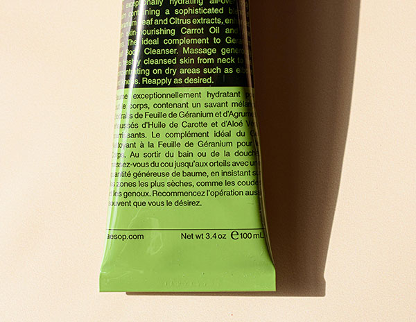
As I navigate through life, I’ve come to realize just how challenging it can be to decipher those tiny, minuscule labels—especially as my eyesight isn’t what it used to be. But this week, I had a wake-up call. Turns out, not being able to read labels isn’t just inconvenient; it can be downright dangerous.
You see, my body doesn’t process iron like most people’s do. So, when I asked my son to check the label of a quick meal replacement I relied on during busy days, we uncovered a startling truth. There was added iron content, sending my levels skyrocketing and causing some alarming heart palpitations.
It was a wake-up call—a reminder that accessibility isn’t just about ramps and Braille. It’s about those tiny fonts that many of us struggle to decipher daily. Whether it’s food labels, medication instructions, or product details, the lack of accessibility affects millions.
But here’s the thing: it doesn’t have to be this way. As our population ages, and as more of us grapple with everyday tasks like reading labels, it’s time for change. It’s time for companies to prioritize accessibility in their packaging and product design.
Imagine a world where labels are clear, legible, and easy to understand for everyone. It’s not just a dream; it’s a possibility—one that we can make a reality by raising awareness and demanding change.
So, I urge you all to join me in this mission. Let’s advocate for accessibility in our daily lives, whether it’s by supporting companies that prioritize it or simply spreading the word.
Together, we can make a world that’s easier to navigate for everyone.

